Symetrics
UX-UI Design for Wealth Management
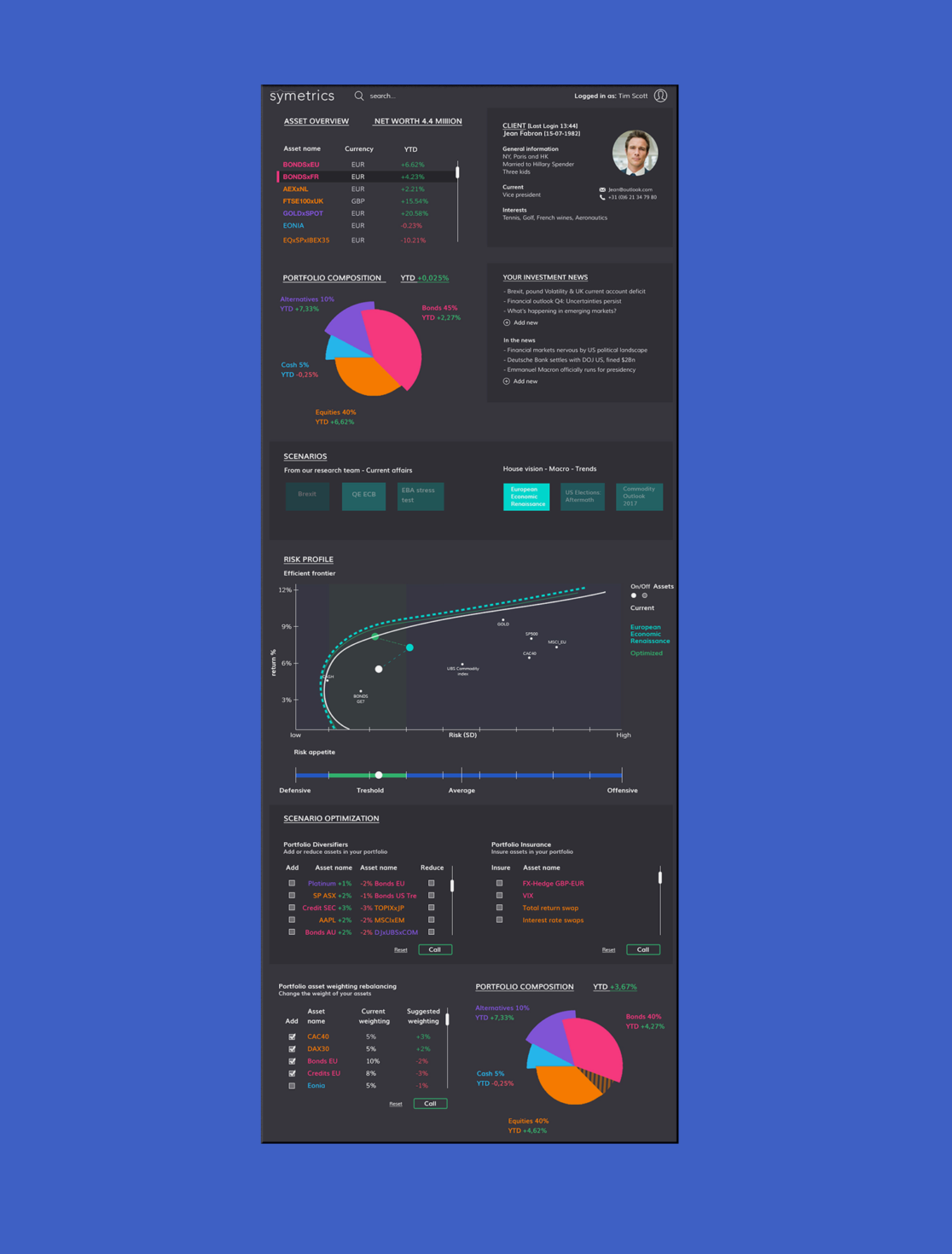
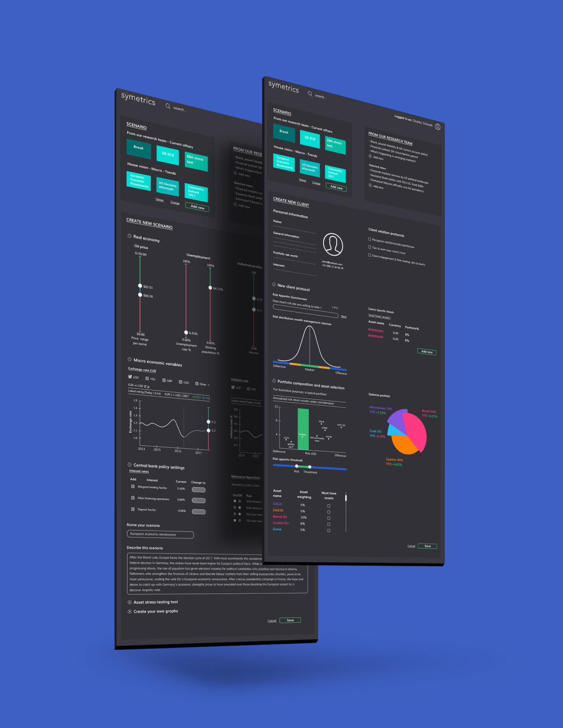
Symetrics offers wealth asset management solutions, they also offer a wealth of insights in your current financials and your asset portfolio containing your investments in cash, bonds, equities and other alternatives. Certain economic, cultural, or political scenarios can have quite an impact on your investments. Symetrics makes it possible to give insight in these scenarios and their consequences, and advise investors on their next move.
Now this is a lot of information to process, and looking at pages and pages of excel sheets and complex mathmatical diagrams can become quite dull after a while, for most of us at least. So they needed a way to represent this information in an appealing, comprehensible and user friendly manner.
While still being able to read and interpret the data with great detail. At Ignation (part of Sogeti) Jeroen Onstwedder and I rolled up our sleeves to tackle this problem. We looked at how data was currently displayed, and put ourselves in the user’s shoes to create a customer journey that made navigating the dashboard, and understanding the data easy as pie.
Symetrics participated in the BNP Paribas Hackathon 2017 with their newly designed dashboard. Quite successfully, they came in second!
Services
- UX Design
- UI Design
- Visual Design


